graphic design for small businesses

The Latest from Broties

We're in the process of wrapping up a job creating some logo stickers for Broties. I can't wait to share them! In the meantime, I wanted to share these latest photos from Aubrey. 

She has been stamping the logo I designed on some gray bags that match her Gerald & Joan-designed business cards. Didn't the stamp turn out great?!?! I'm so proud of this logo!

brotiesstamp

I also wanted to share this photo from her Facebook page. This girl is so talented! It has been such an honor to work with her.

By the way, Christmas is just around the corner, and it's not too early to do a little handmade holiday shopping in her Etsy shop. She makes Broties for men and little boys, so you could easily find something for every guy on your list!

broties2

gerald & joan brand edit

G&JStyleSheet_2014.jpg

When I began sketching out ideas for the new website, I looked at the entire Gerald & Joan brand -- logo, branding, marketing materials, services, blog, etc. I was happy with the overall feel of our branding, but I wanted to streamline and edit each of the elements before we headed into our second year. 

The major change in our branding was the switch from tan, brown and sepia to dusty grey,  vintage mint, black and white. After a year of working with an earthy color palette, I decided that incorporating black and white as a part of the new color palette would totally streamline the brand's look. The color combination of black and white is classic and fresh (think little black dress and pearls). I kept the dusty grey as an ode to the former color palette, and then I added the vintage mint as our statement color (continuing the LBD analogy, the mint represents the statement shoes). I think the resulting color palette is sheer perfection. 

When it came to selecting fonts, I knew I wanted something that would look great in print and on the web. Georgia was a no-brainer, and I loved the handwritten look that Homemade Apple Pro provided. When paired together, they strike a nice balance between vintage and classic.

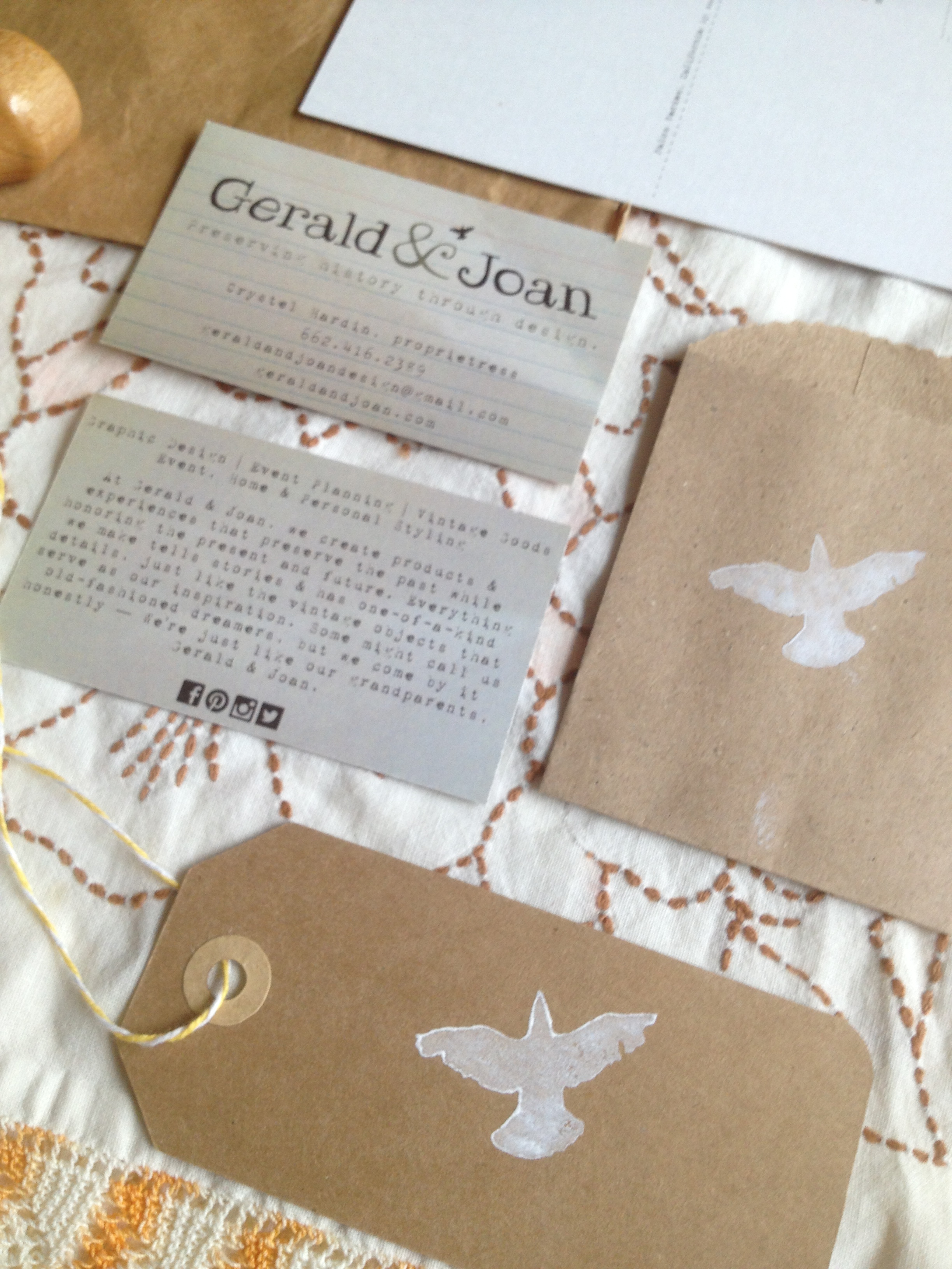
The vertical line, ampersand and bird are our original brand elements, but they look completely different in mint. The white bird in the mint circle is my favorite motif. The final touch was the addition of the 1940s black and white photograph of Joan. Vintage photography has been an important part of the G&J story since our beginning, so it made sense to use a vintage family photograph as a brand element. Additional photographs (some black and white, some color) are featured on the interior pages of the website. Like the fonts and color palette, the photographs feel both vintage and timeless. I love how they pop against the website's white background. 

I was really thrilled with the results of Gerald & Joan's first brand edit, and I'm getting ready to apply them to our marketing materials. I will share the results soon!

Do you need help wtih personal, business or nonprofit branding? We're here if you need us!

New Design Offerings from Gerald & Joan

Blue skies. When I launched Gerald & Joan in January, the focus was strictly on graphic design, event planning, event styling and handmade goods. These are my passions, so it felt natural to build my company around them.

However, after seven years in the communications world, I quickly realized that it is hard to turn off those skills that have been a part of my career for so long. It's also hard to shun that very expensive piece of paper that reads Bachelor of Arts in Print Journalism and Public Relations....so, instead of putting the PR, copywriting, social media, blogging and email marketing that I once did for a living on the back burner, I decided to embrace them. After all, the essence of Gerald & Joan is storytelling, and communications work is storytelling. From that angle, it makes perfect sense that it should be a piece of the larger Gerald & Joan puzzle.

The charitable partnerships piece fits into Gerald & Joan because I would be working for a charity if I wasn't living this dream. I began volunteering in high school, and I worked with charities for the majority of my career. Those experiences taught me everything that I know today and continue to be a huge part of who I am. Whether it’s matching a business to a charity or assisting a charity in the areas of writing, branding and design, I want to support nonprofit work and assist them as they build their brands and tell their stories.

So far this year has been a glorious whirlwind of inspiration and excitement. I'm excited to take this next step and share these new offerings.

Thank you, dear family and friends, for your constant love and support and for being such an integral part of the Gerald & Joan journey. Let me know if I can help you in some way!

Branding: Gerald & Joan

photo-copy-8.jpg

If you've read this post, then you already know the story behind the Gerald & Joan logo. When considering options for Gerald & Joan's branding, we knew we wanted to do something nostalgic and fun, but we also wanted to keep our costs down. Using vintage index cards and postcards as our inspiration, we designed our business cards and correspondence postcards and had them printed locally for a nominal fee. The business card design will likely stay the same, but the postcard is the first in a series that we'll distribute as a way to thank our clients and vendors. It features one of our favorite places in the world -- Palos Verdes, California. You might also recognize Jonathan on the card. This first postcard is a little tribute to him because there wouldn't be a Gerald & Joan without his love and support!

To complete our look, we brought in some of our favorite things. The brown "grocery sack" tags and bags add to the nostalgia, and they are customized with a Gerald & Joan bird stamp. Custom stamps are an affordable way to personalize standard paper and fabric, and they are so fun to collect! We are now taking custom stamp orders, so if you need a stamp for a wedding or event, please feel free to contact us for sizes and pricing!

Yellow bakers twine, vintage yellow ribbon, yellow washi tape, traditional twine and vintage linens in our yellow/cream/brown color palette complete our vintage-inspired look. We think the branding marries the Gerald & Joan concept of "timeless with a hint of nostalgia" perfectly, and we are so pleased with the way each piece turned out!

[gallery type="square" columns="2" ids="750,748,749,751"]