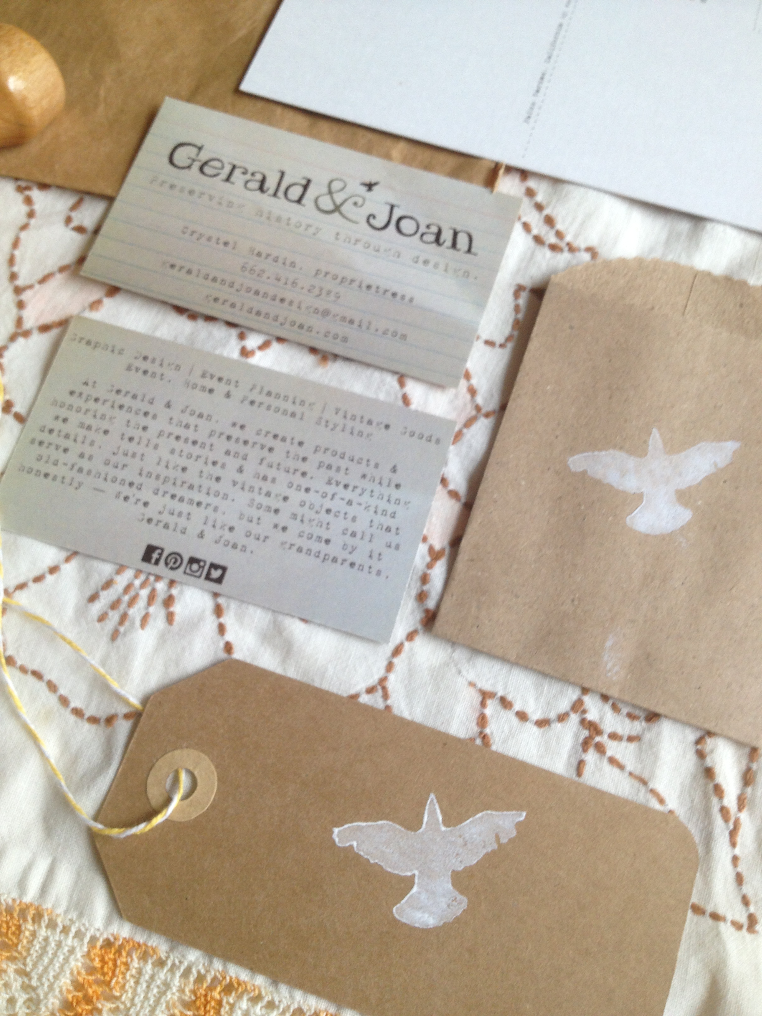
When I began sketching out ideas for the new website, I looked at the entire Gerald & Joan brand -- logo, branding, marketing materials, services, blog, etc. I was happy with the overall feel of our branding, but I wanted to streamline and edit each of the elements before we headed into our second year.
The major change in our branding was the switch from tan, brown and sepia to dusty grey, vintage mint, black and white. After a year of working with an earthy color palette, I decided that incorporating black and white as a part of the new color palette would totally streamline the brand's look. The color combination of black and white is classic and fresh (think little black dress and pearls). I kept the dusty grey as an ode to the former color palette, and then I added the vintage mint as our statement color (continuing the LBD analogy, the mint represents the statement shoes). I think the resulting color palette is sheer perfection.
When it came to selecting fonts, I knew I wanted something that would look great in print and on the web. Georgia was a no-brainer, and I loved the handwritten look that Homemade Apple Pro provided. When paired together, they strike a nice balance between vintage and classic.
The vertical line, ampersand and bird are our original brand elements, but they look completely different in mint. The white bird in the mint circle is my favorite motif. The final touch was the addition of the 1940s black and white photograph of Joan. Vintage photography has been an important part of the G&J story since our beginning, so it made sense to use a vintage family photograph as a brand element. Additional photographs (some black and white, some color) are featured on the interior pages of the website. Like the fonts and color palette, the photographs feel both vintage and timeless. I love how they pop against the website's white background.
I was really thrilled with the results of Gerald & Joan's first brand edit, and I'm getting ready to apply them to our marketing materials. I will share the results soon!
Do you need help wtih personal, business or nonprofit branding? We're here if you need us!


