We recently debuted the Anna invitation suite that matches our Anna program. This week we created the Anna menu card and Anna thank you note that correspond with the suite. The rustic fonts, vintage linen and whimsical birds and doilies would be lovely for a country wedding in any season. The font and doily colors can be customized to match your weddings colors. If you're interested purchasing this rustic-vintage design for your upcoming wedding or event, contact us here for pricing.


anna invitation suite

I created the Anna program last fall for my brother-in-law and his bride's December wedding. The wedding took place in the Mississippi countryside at the bride's family church. It was an intimate affair that included a mixture of vintage and rustic details -- family heirlooms, natural touches and some handmade elements -- so the vintage handkerchief and doily design with birds suited the day perfectly. The bride liked the idea of using an array of fonts in a block format, so I selected several lovely fonts that worked well together. The result was a design that is simple, timeless and so pretty.
I recently created the invitation and RSVP card to go along with the program, and I plan to add more pieces to the collection including menu cards and thank you notes. This is the first peek at the invitation suite. Samples are coming soon!
The great thing about a timeless design like this one is that it would work for a wedding in any season. The vintage hankie provides the foundation, and then the fonts and decorative motifs can be adjusted to fit any color scheme. To complete the look, we'd tie the invitation, RSVP card and response envelope together with vintage lace and place it inside a kraft envelope.
Interested in this design for your upcoming wedding? Contact us here to receive a custom proposal. We would love to help you tell your special wedding story.
gerald & joan brand edit

When I began sketching out ideas for the new website, I looked at the entire Gerald & Joan brand -- logo, branding, marketing materials, services, blog, etc. I was happy with the overall feel of our branding, but I wanted to streamline and edit each of the elements before we headed into our second year.
The major change in our branding was the switch from tan, brown and sepia to dusty grey, vintage mint, black and white. After a year of working with an earthy color palette, I decided that incorporating black and white as a part of the new color palette would totally streamline the brand's look. The color combination of black and white is classic and fresh (think little black dress and pearls). I kept the dusty grey as an ode to the former color palette, and then I added the vintage mint as our statement color (continuing the LBD analogy, the mint represents the statement shoes). I think the resulting color palette is sheer perfection.
When it came to selecting fonts, I knew I wanted something that would look great in print and on the web. Georgia was a no-brainer, and I loved the handwritten look that Homemade Apple Pro provided. When paired together, they strike a nice balance between vintage and classic.
The vertical line, ampersand and bird are our original brand elements, but they look completely different in mint. The white bird in the mint circle is my favorite motif. The final touch was the addition of the 1940s black and white photograph of Joan. Vintage photography has been an important part of the G&J story since our beginning, so it made sense to use a vintage family photograph as a brand element. Additional photographs (some black and white, some color) are featured on the interior pages of the website. Like the fonts and color palette, the photographs feel both vintage and timeless. I love how they pop against the website's white background.
I was really thrilled with the results of Gerald & Joan's first brand edit, and I'm getting ready to apply them to our marketing materials. I will share the results soon!
Do you need help wtih personal, business or nonprofit branding? We're here if you need us!
Personal Photo Book Design
joanphotobook1
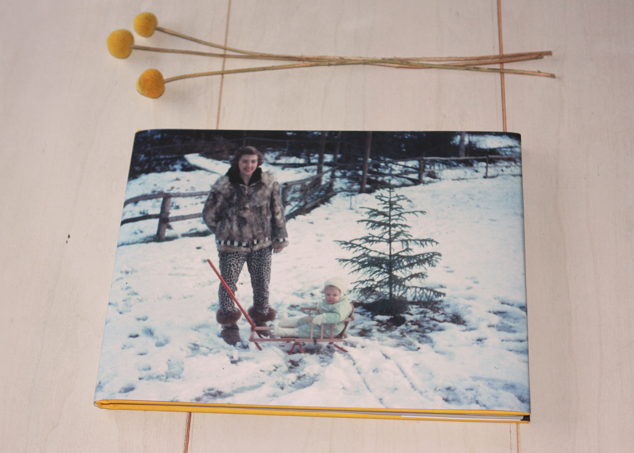
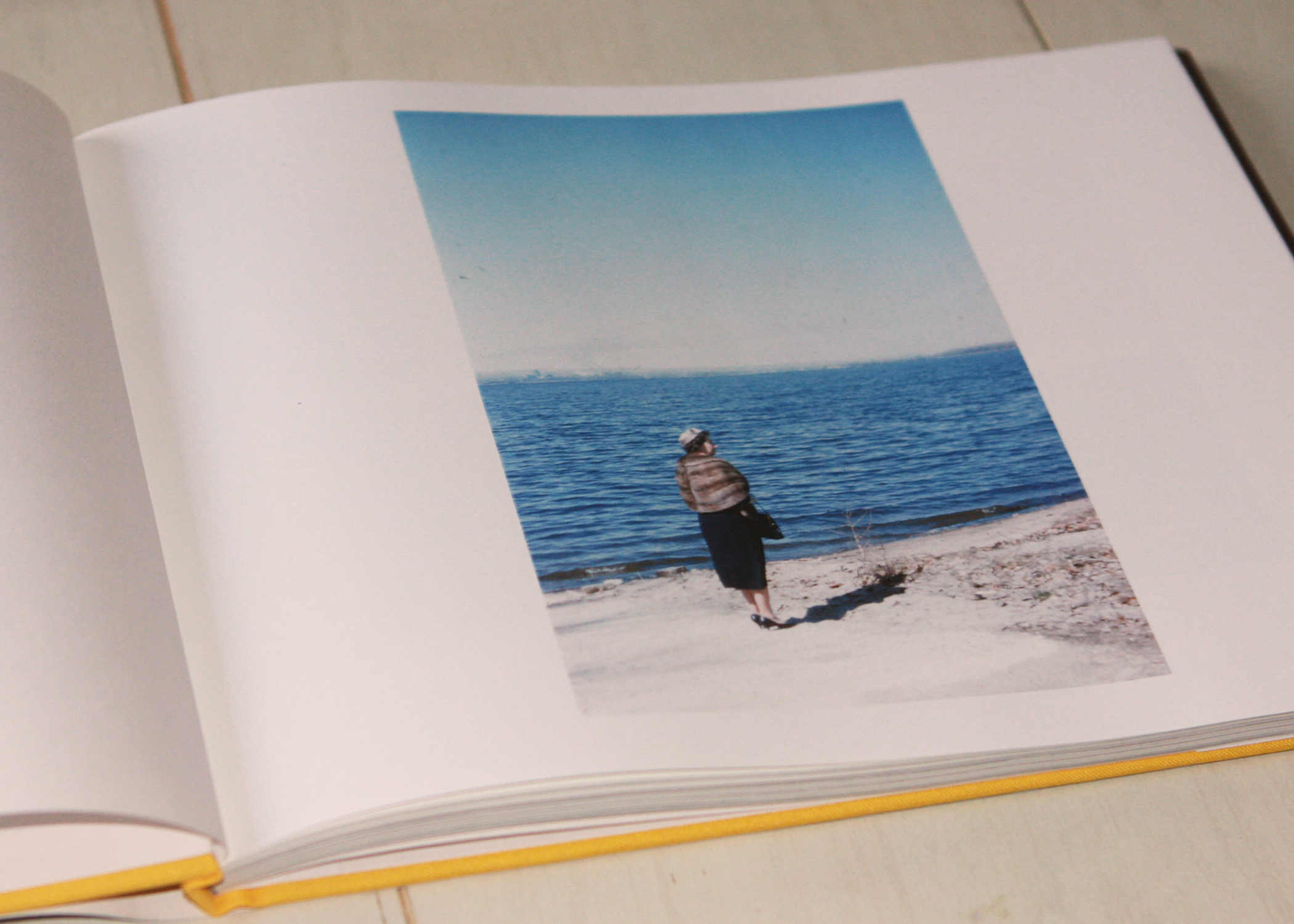
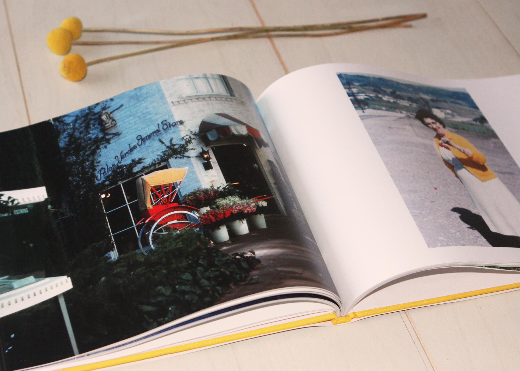
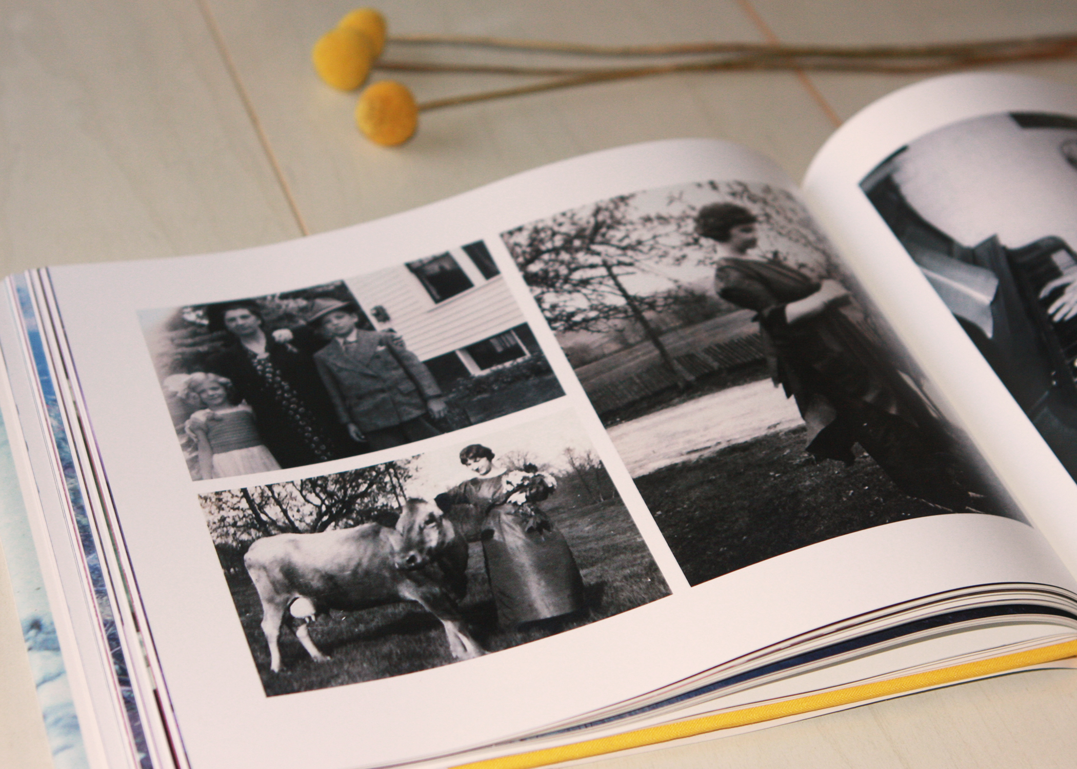
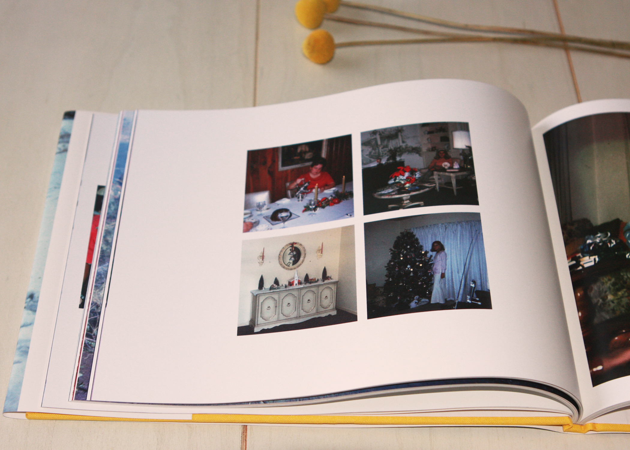
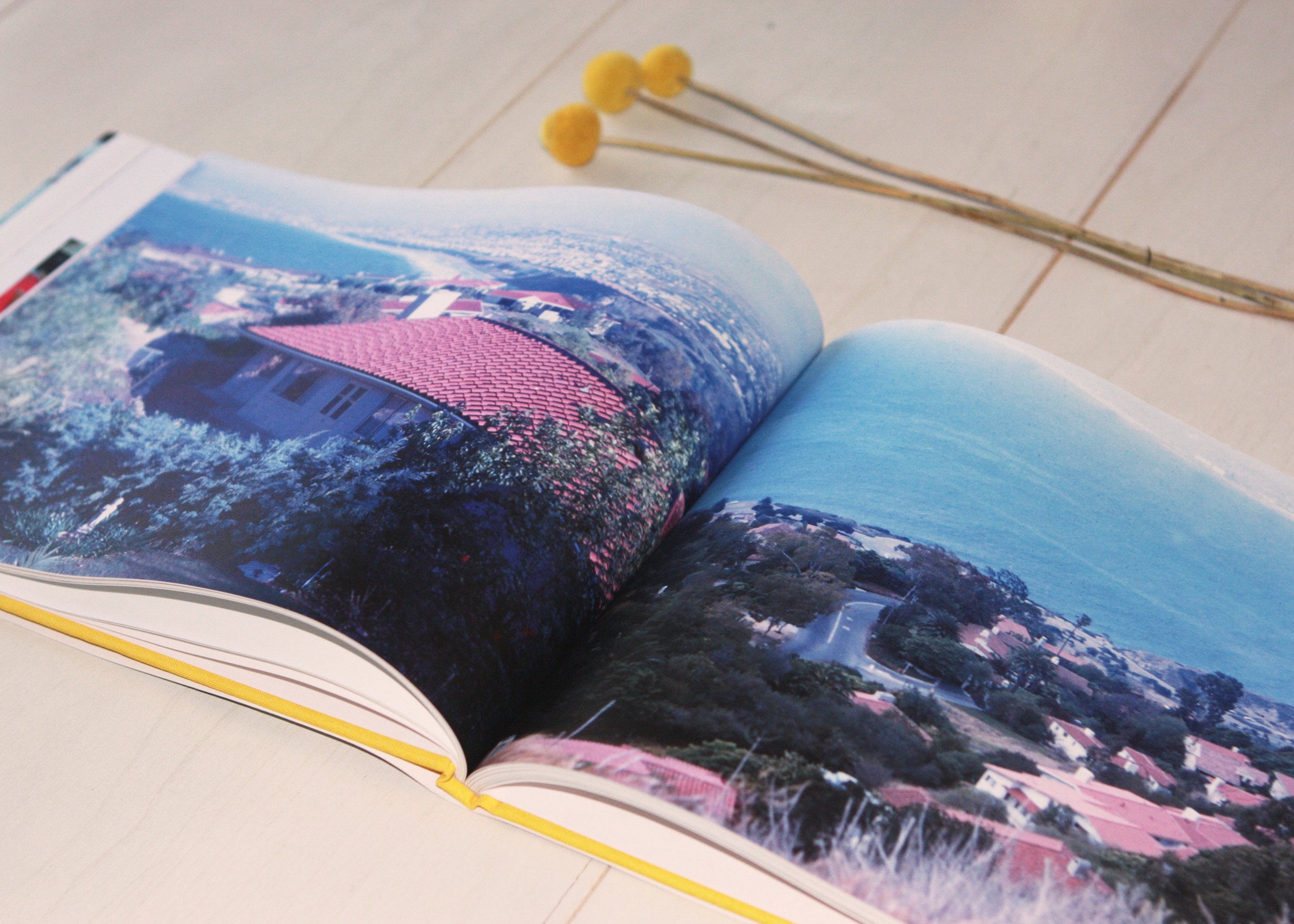
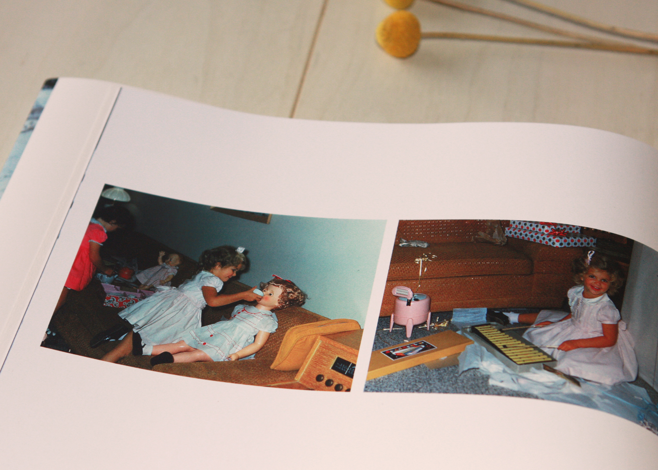
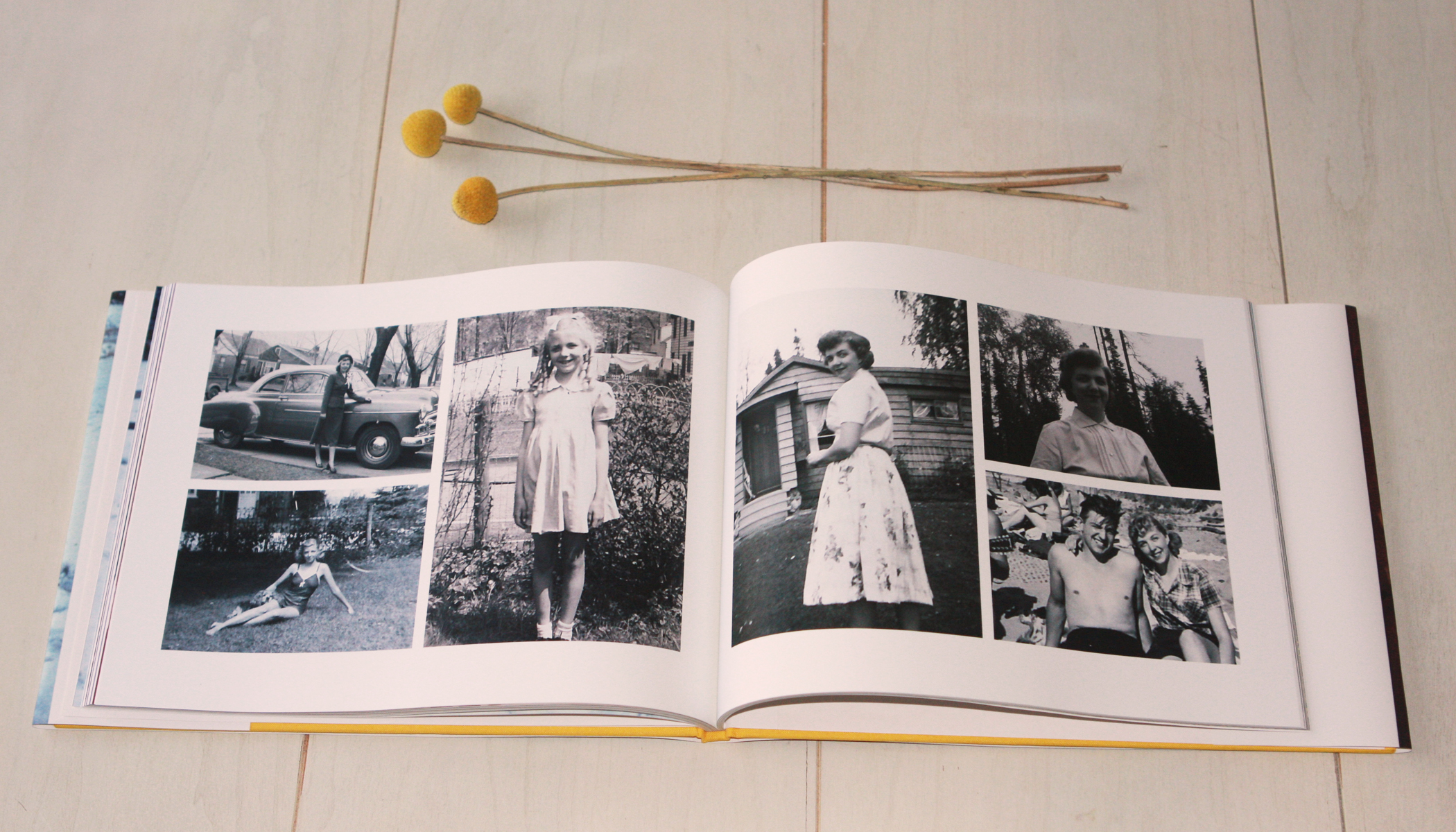
Behind the scenes here at Gerald and Joan, we are undergoing a brand review just in time for our one-year anniversary (coming up next month). We are reviewing every aspect of our brand including our logo, services, blog, website and even the website platform. When we launched Gerald and Joan last year, our lives looked drastically different, and as we've grown and changed, we felt our brand needs to reflect those changes. One of the new service offerings for 2014 will be photo books for personal, business and nonprofit clients. To show what we can do, I wanted to share this photo book that I designed as a Christmas gift for my mother. It is 100 pages and includes many of the family stories images that I have scanned over the past few months. It was a perfect gift for her, and it was so much fun to create. I hope that Gerald and Joan will be doing many of these books for clients in 2014. They make excellent gifts for birthdays, weddings, anniversaries, the list goes on and on! :)
joanphotobook2

joanphotobook3
joanphotobook4
joanphotobook5
joanphotobook6
joanphotobook7
joanphotobook8

joanphotobook9
joanphotobook10
Here's a peek at another photo book I created recently for my nonprofit client Habitat for Humanity of Greater Memphis.