Business

one year ago...

One year ago, Gerald & Joan played a part in this wedding. A simple twist of fate made it possible, and the experience was truly life-changing. Thank you, Lauren and Chris, for allowing us to help create your dream wedding day. It launched our own small business dreams...

program
flowers
bunting
ceremonyvenue
filecabinet
Cannon_Durham_Amy_Hutchinson_Photography_amyhutchinsondurham121.jpg
candybar
Cannon_Durham_Amy_Hutchinson_Photography_amyhutchinsondurham133.jpg
happilyeverafter
LOVEletters
Cannon_Durham_Amy_Hutchinson_Photography_amyhutchinsondurham138.jpg
menu
Cannon_Durham_Amy_Hutchinson_Photography_amyhutchinsondurham207.jpg
couple

Happy (early) anniversary, Lauren and Chris!

Vintage props, styling, LOVE letters, bunting, menus and programs by Gerald & Joan. 

Photography by Amy Hutchison.

gerald & joan brand edit

G&JStyleSheet_2014.jpg

When I began sketching out ideas for the new website, I looked at the entire Gerald & Joan brand -- logo, branding, marketing materials, services, blog, etc. I was happy with the overall feel of our branding, but I wanted to streamline and edit each of the elements before we headed into our second year. 

The major change in our branding was the switch from tan, brown and sepia to dusty grey,  vintage mint, black and white. After a year of working with an earthy color palette, I decided that incorporating black and white as a part of the new color palette would totally streamline the brand's look. The color combination of black and white is classic and fresh (think little black dress and pearls). I kept the dusty grey as an ode to the former color palette, and then I added the vintage mint as our statement color (continuing the LBD analogy, the mint represents the statement shoes). I think the resulting color palette is sheer perfection. 

When it came to selecting fonts, I knew I wanted something that would look great in print and on the web. Georgia was a no-brainer, and I loved the handwritten look that Homemade Apple Pro provided. When paired together, they strike a nice balance between vintage and classic.

The vertical line, ampersand and bird are our original brand elements, but they look completely different in mint. The white bird in the mint circle is my favorite motif. The final touch was the addition of the 1940s black and white photograph of Joan. Vintage photography has been an important part of the G&J story since our beginning, so it made sense to use a vintage family photograph as a brand element. Additional photographs (some black and white, some color) are featured on the interior pages of the website. Like the fonts and color palette, the photographs feel both vintage and timeless. I love how they pop against the website's white background. 

I was really thrilled with the results of Gerald & Joan's first brand edit, and I'm getting ready to apply them to our marketing materials. I will share the results soon!

Do you need help wtih personal, business or nonprofit branding? We're here if you need us!

Personal Photo Book Design

joanphotobook1
joanphotobook1

Behind the scenes here at Gerald and Joan, we are undergoing a brand review just in time for our one-year anniversary (coming up next month). We are reviewing every aspect of our brand including our logo, services, blog, website and even the website platform. When we launched Gerald and Joan last year, our lives looked drastically different, and as we've grown and changed, we felt our brand needs to reflect those changes. One of the new service offerings for 2014 will be photo books for personal, business and nonprofit clients. To show what we can do, I wanted to share this photo book that I designed as a Christmas gift for my mother. It is 100 pages and includes many of the family stories images that I have scanned over the past few months. It was a perfect gift for her, and it was so much fun to create. I hope that Gerald and Joan will be doing many of these books for clients in 2014. They make excellent gifts for birthdays, weddings, anniversaries, the list goes on and on! :)

joanphotobook2
joanphotobook2
joanphotobook3
joanphotobook3
joanphotobook4
joanphotobook4
joanphotobook5
joanphotobook5
joanphotobook6
joanphotobook6
joanphotobook7
joanphotobook7
joanphotobook8
joanphotobook8
joanphotobook9
joanphotobook9
joanphotobook10
joanphotobook10

Here's a peek at another photo book I created recently for my nonprofit client Habitat for Humanity of Greater Memphis.

Vintage Palos Verdes, California

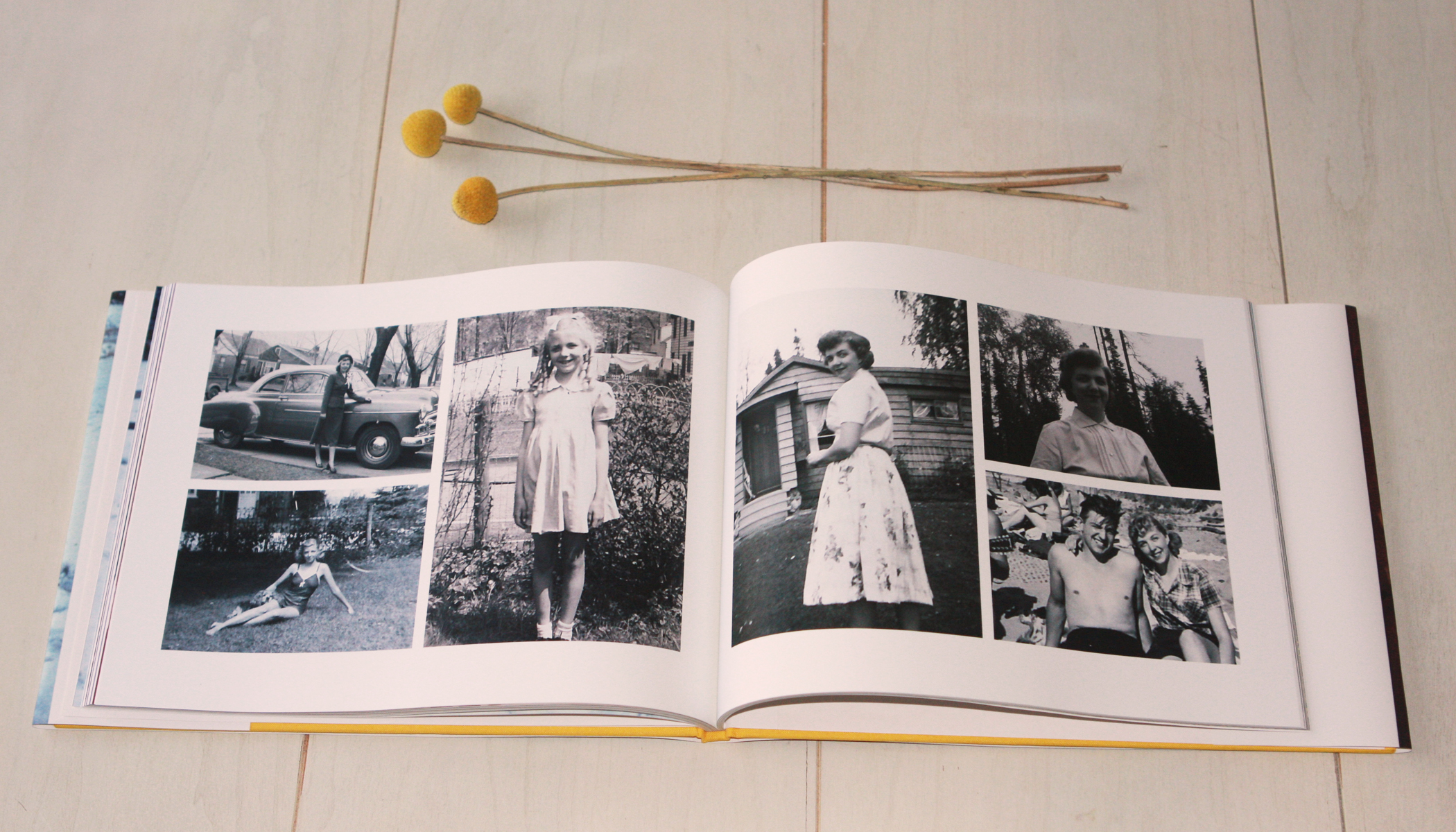
For the past year, Palos Verdes, California (and the South Bay area in general) has been recurring theme on this blog (the most recent post was this one). PV was my family's home from 1960 to 1973. When my great-grandmother Elsie passed away in 1973, she asked that the house be sold and that her ashes be spread over the Pacific Ocean near PV. Her three children respected those wishes. Both of her daughters remained in California, but neither one lived in Palos Verdes again. As a child, I don't remember visiting PV very much. I think the first trip we made up the peninsula was in 1994, but I remember that it had a huge impact on me. I wanted to visit PV during every vacation, but I think we only visited one or two other times before Joan's death in 2003. After our first California vacation together in 2005, Jonathan and I began spending more time in the South Bay area, and our day trips to PV became highlights. The combination of the natural beauty of the coastline and the pristine mid-century California homes captured our hearts. After scanning so many film slides over the past few months, it became clear to me that we are drawn there for other reasons as well. It is part of our history and our family's story.

Palos Verdes California 11

La Venta Inn in Palos Verdes, California around 1960.

Palos Verdes 10

Palos Verdes, California circa 1960.

Palos Verdes 9

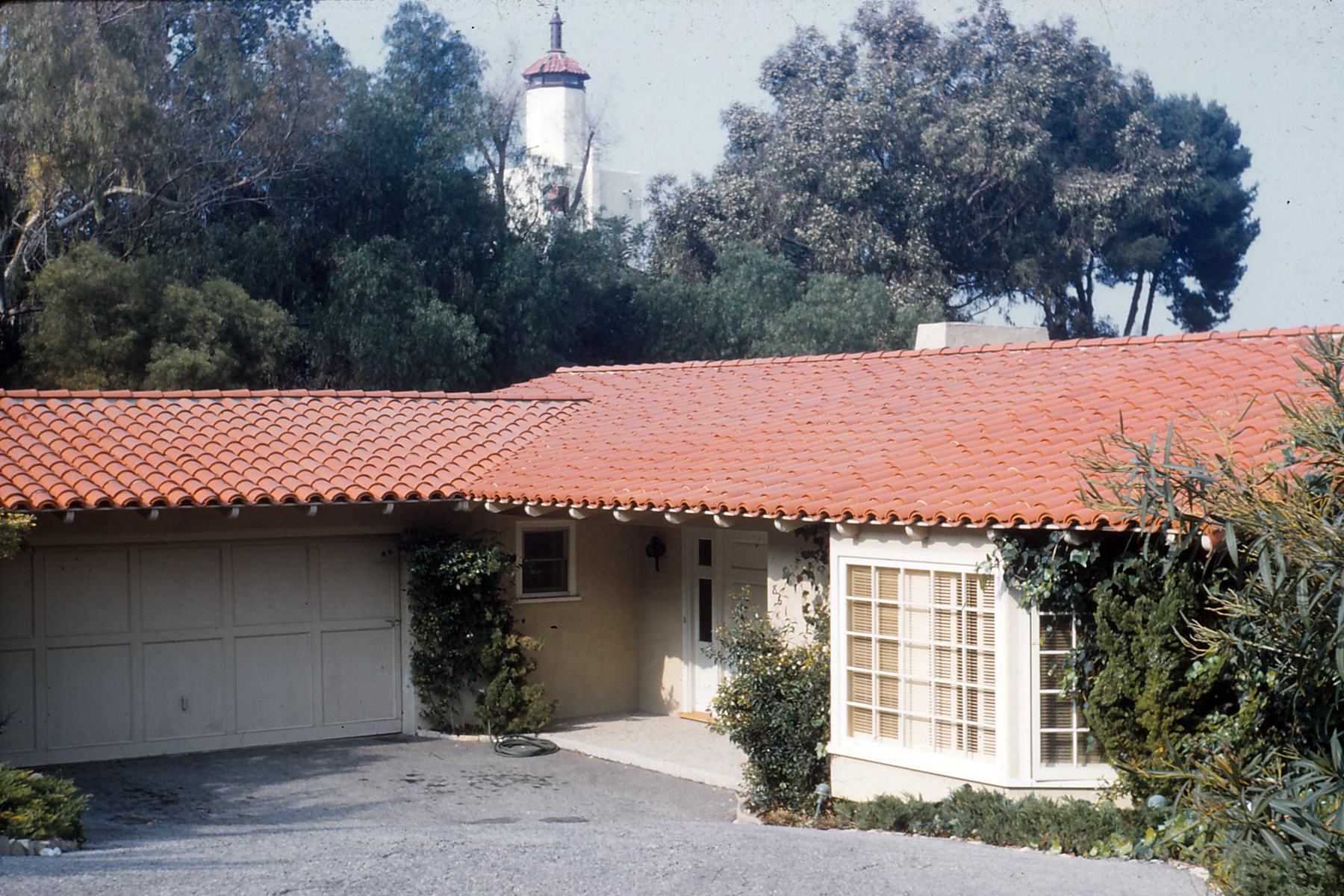
Elsie's home in Palos Verdes, circa 1960.

Palos Verdes 8

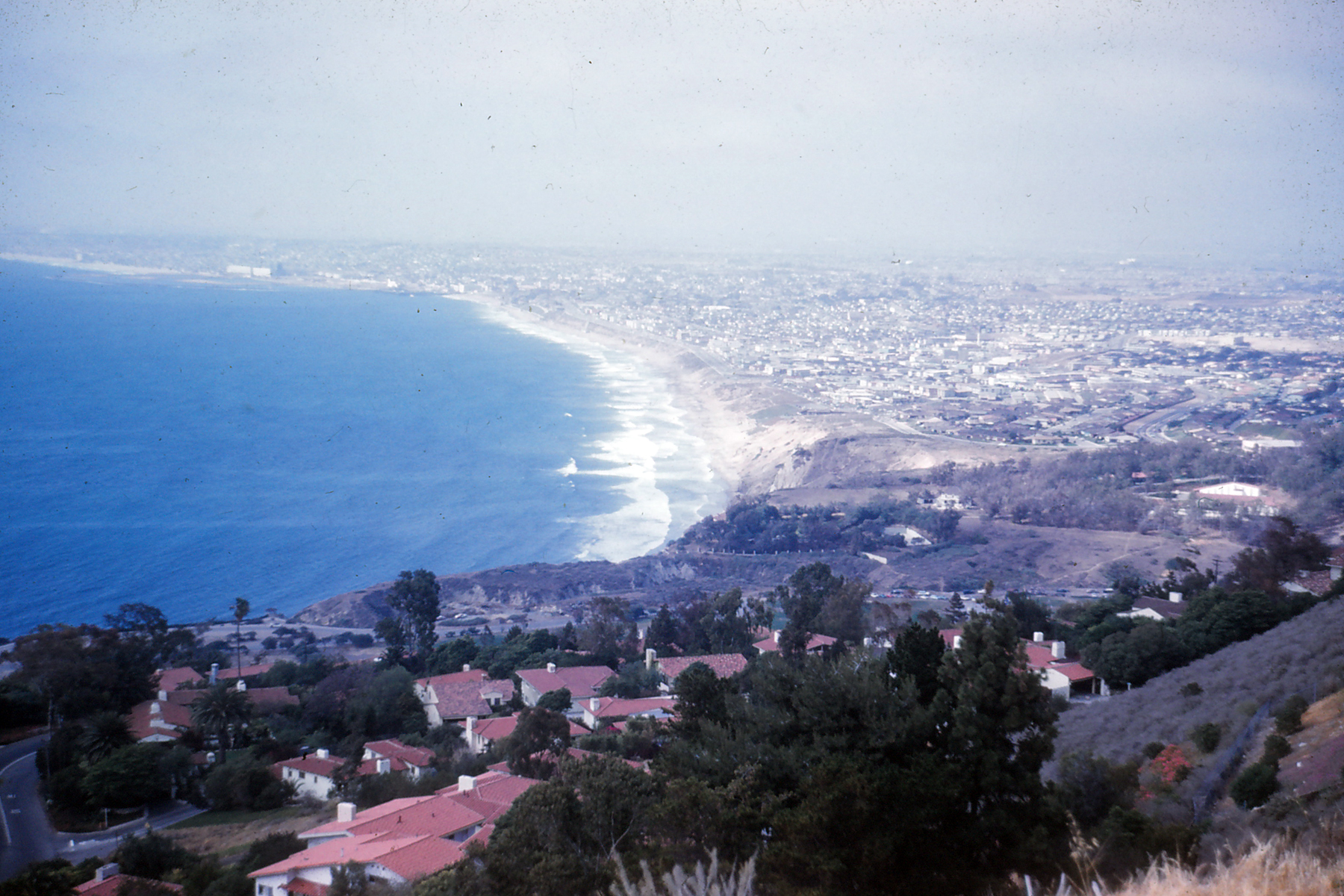
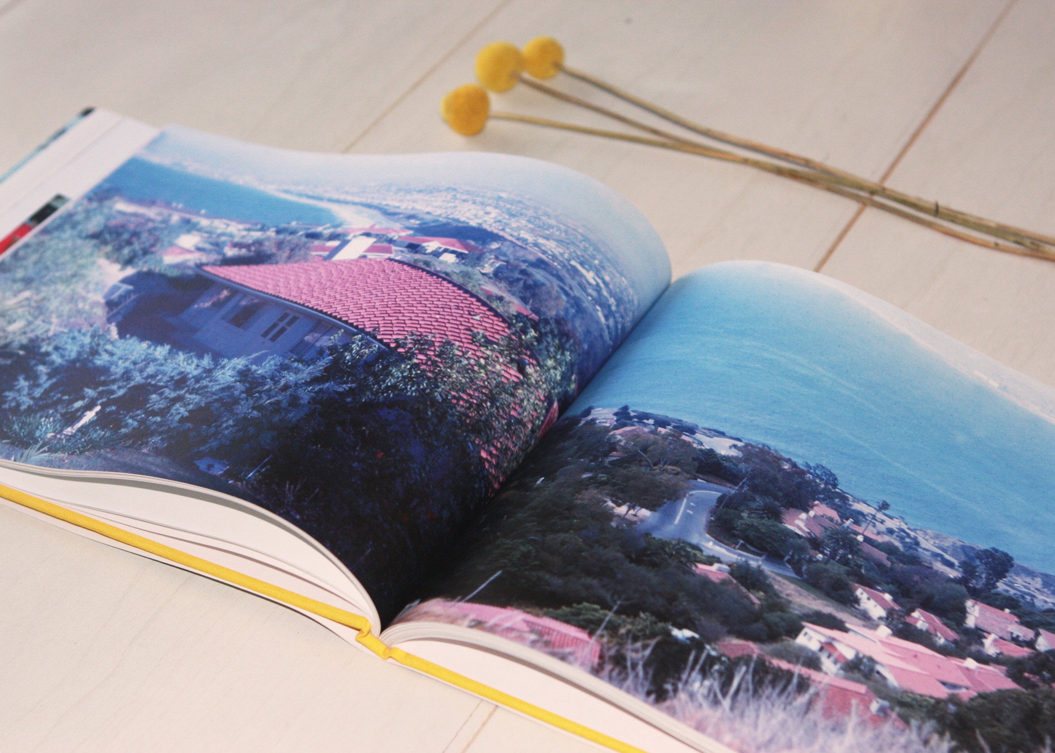
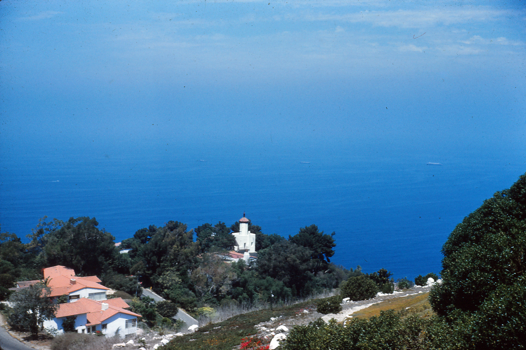
A view of the South Bay - Redondo, Hermosa and Manhattan Beaches -- from Palos Verdes, circa 1960.

Palos Verdes 6

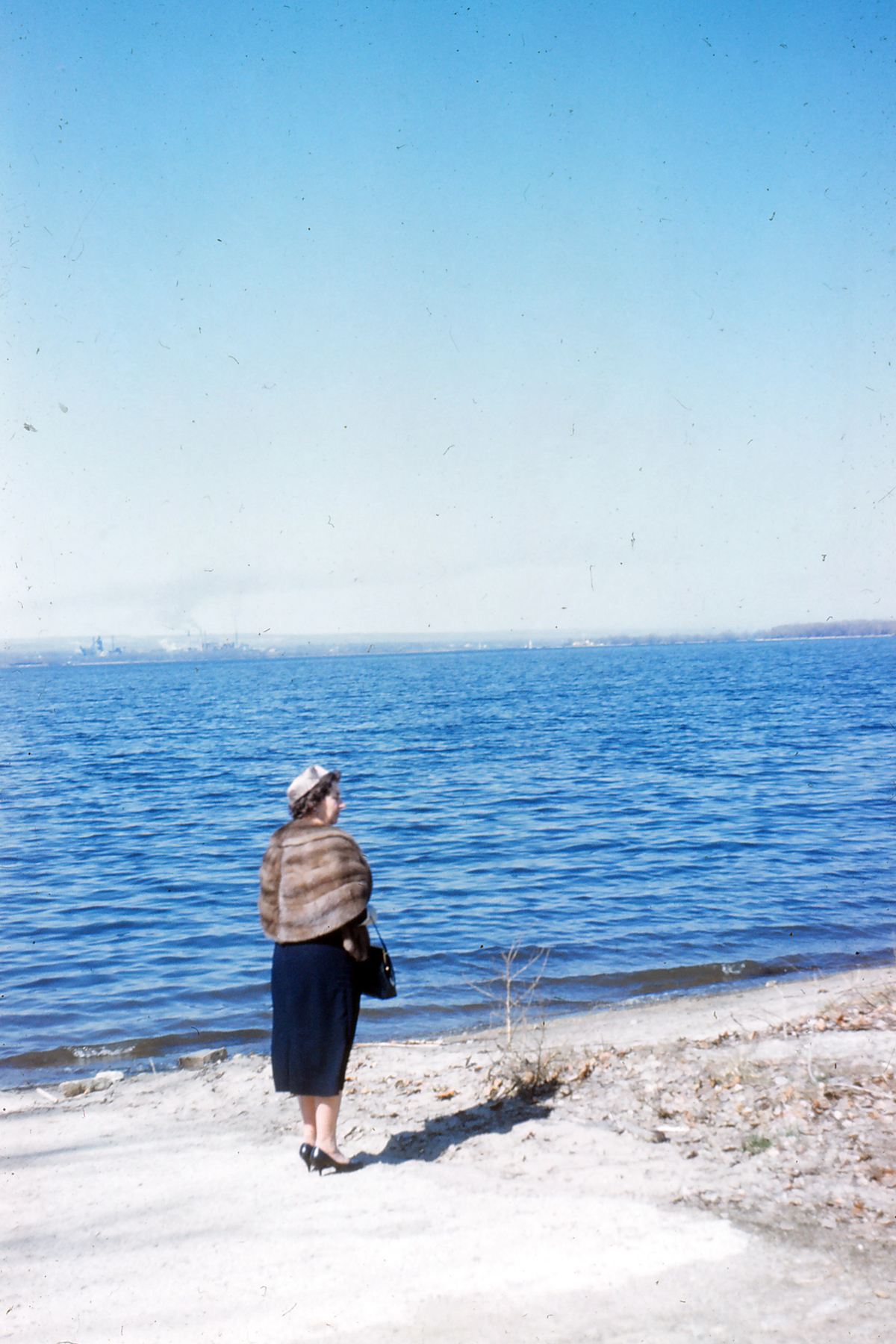
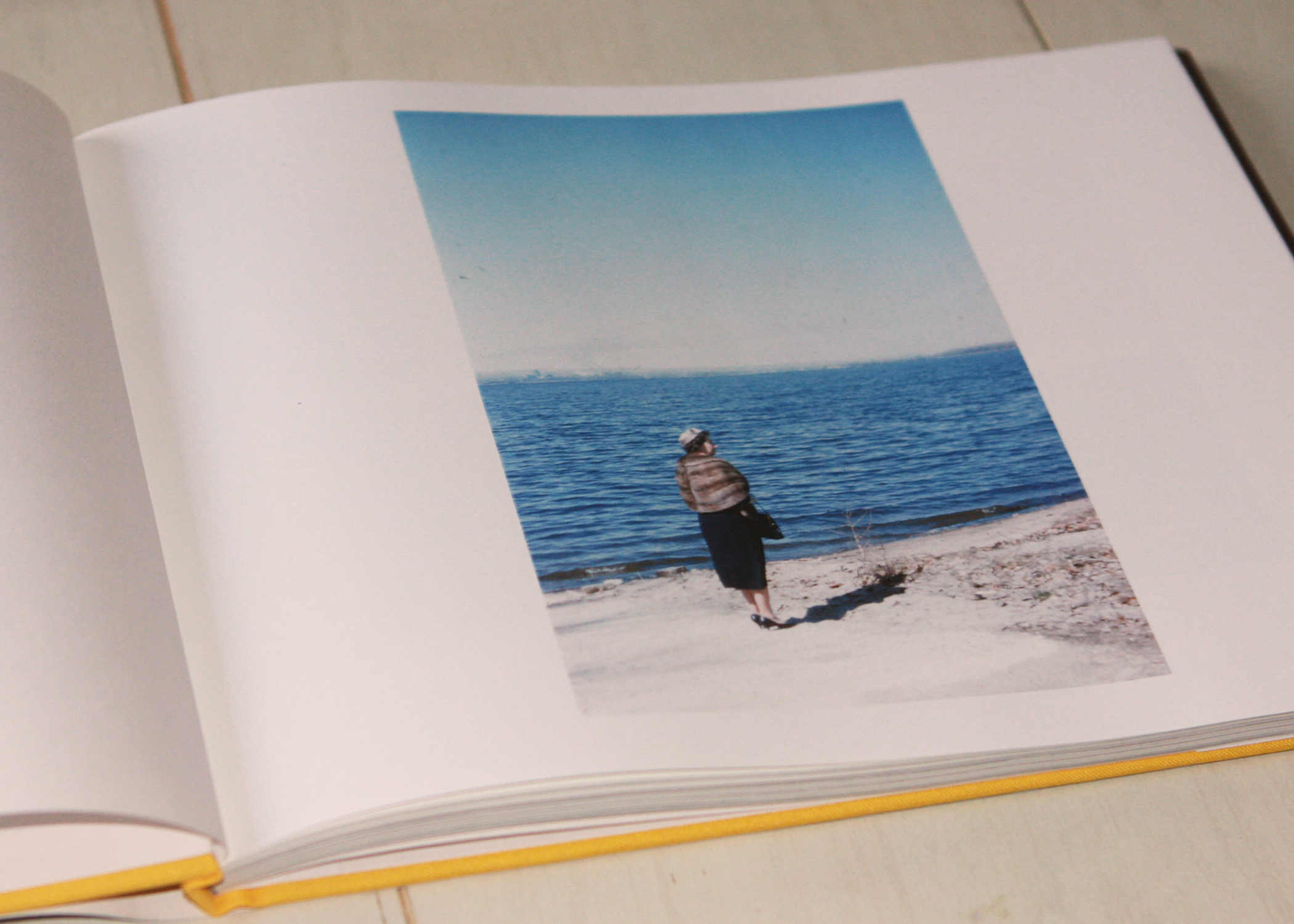
Elsie at the beach, circa 1960.

Palos Verdes 5

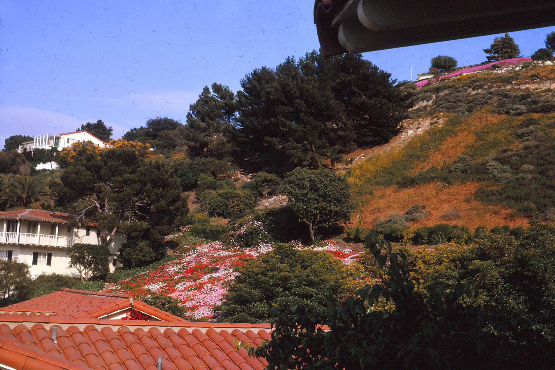
Looking up the hill from Elsie's backyard, circa 1960.

Palos Verdes 4

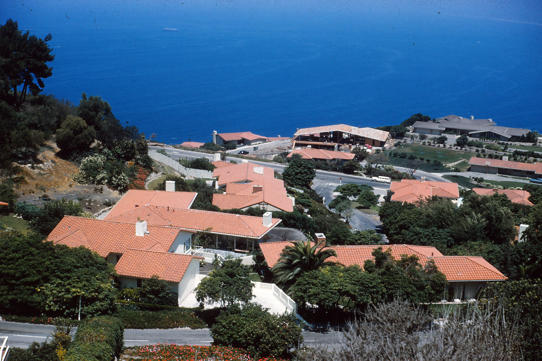
Beautiful mid-century Palos Verdes homes, circa 1960.

Palos Verdes 3

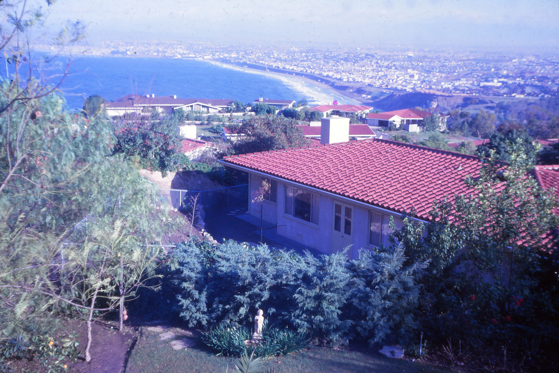
A view of Elsie's backyard in Palos Verdes, taken around 1960.

Palos Verdes 2

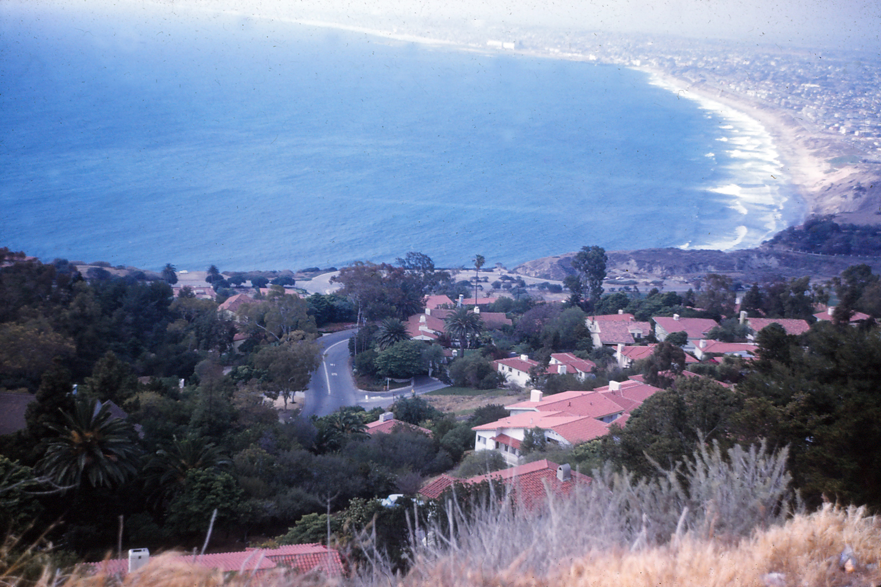
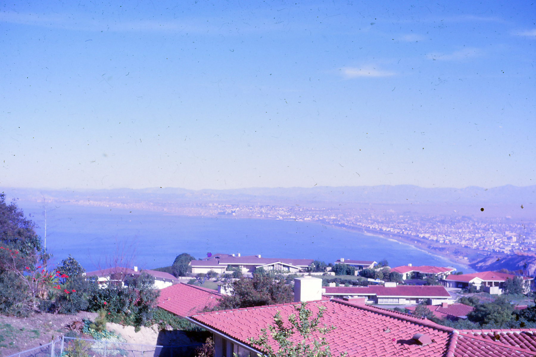
Another view of the South Bay, taken around 1960.

Palos Verdes 7

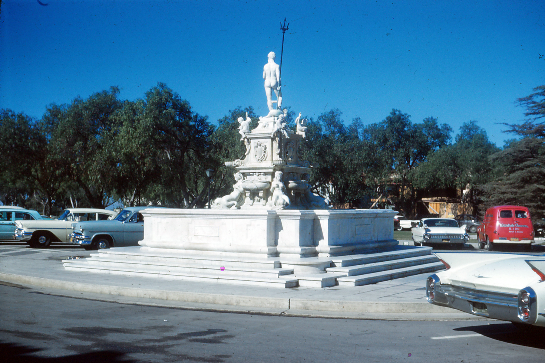
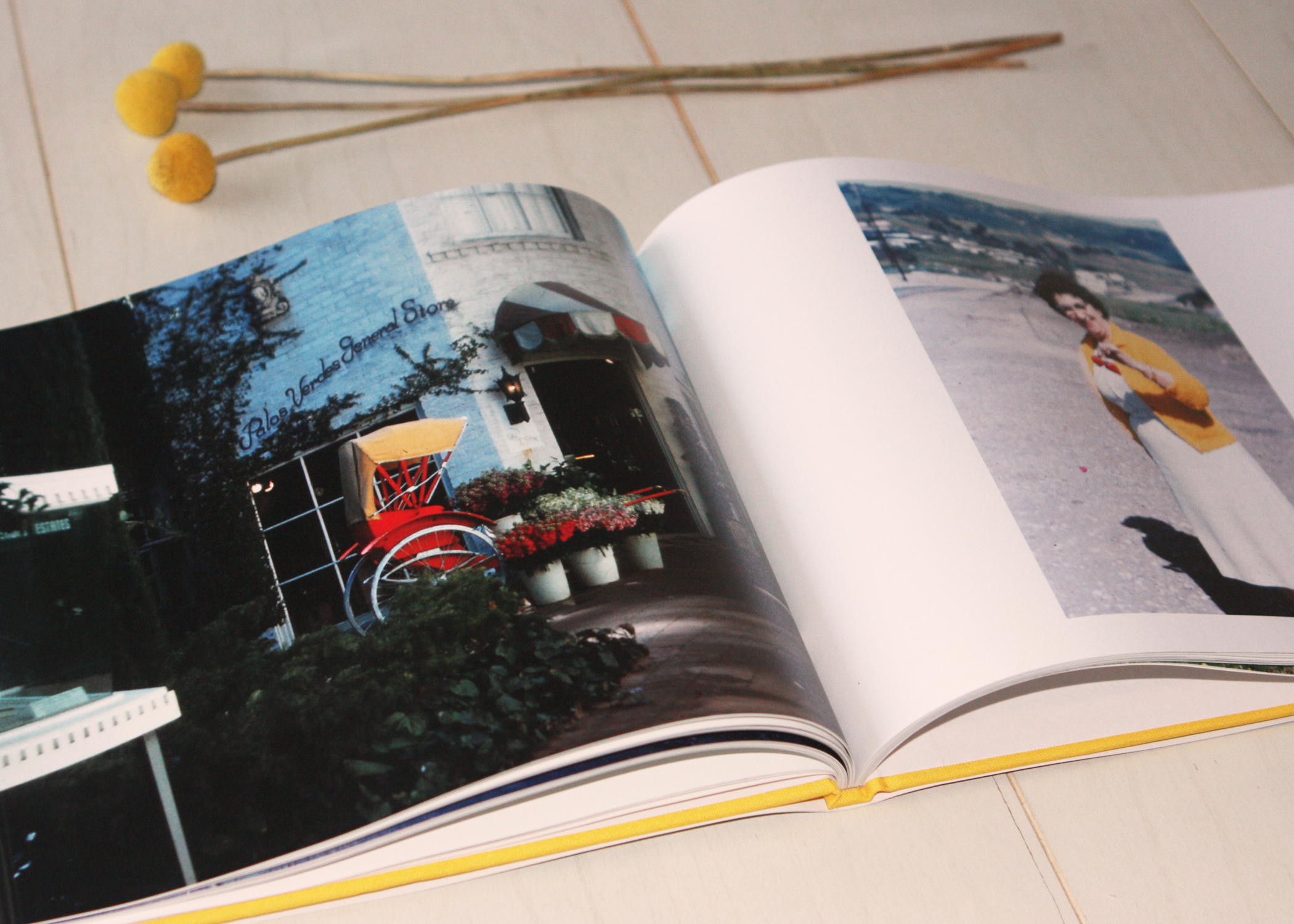
Malaga Cove Plaza, circa 1960.

IMG_1738

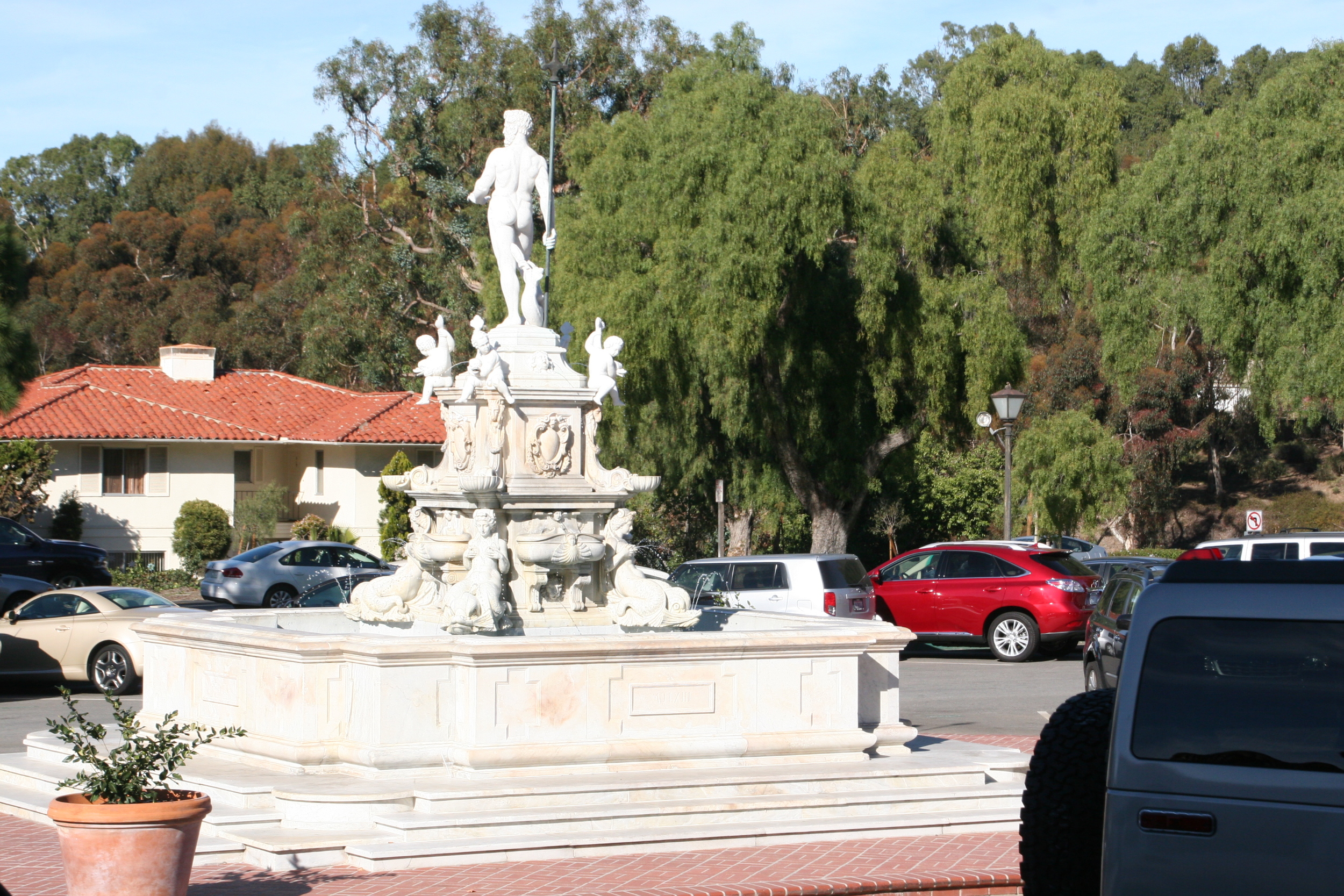
And just for fun...a recent shot of the same fountain!

Palos Verdes 1

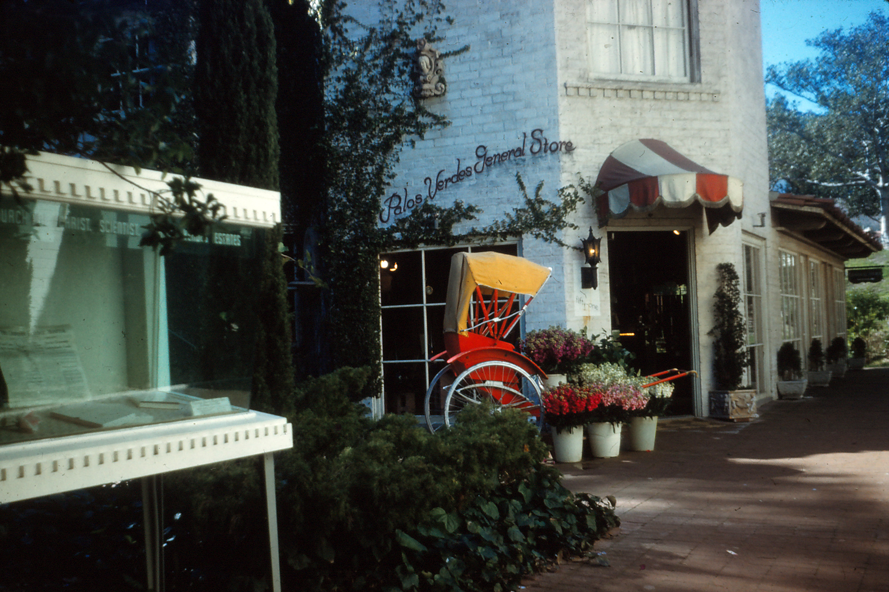
Also in Malaga Cove Plaza was the Palos Verdes General Store, circa 1960.

IMG_1732

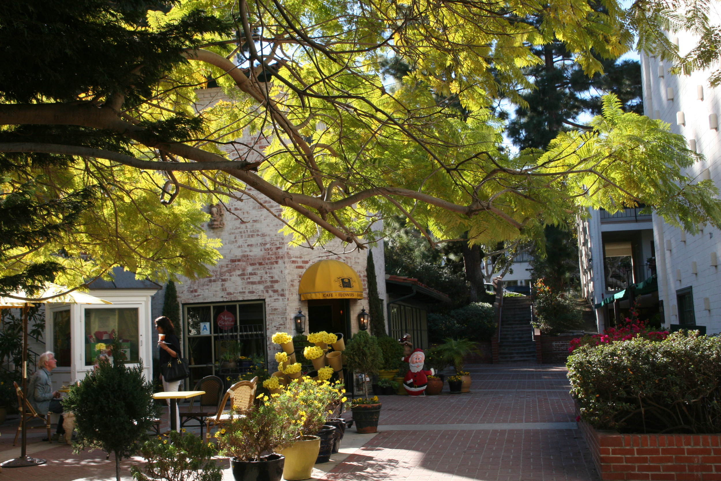
Here's the same building in recent years.

Palos Verdes California 12

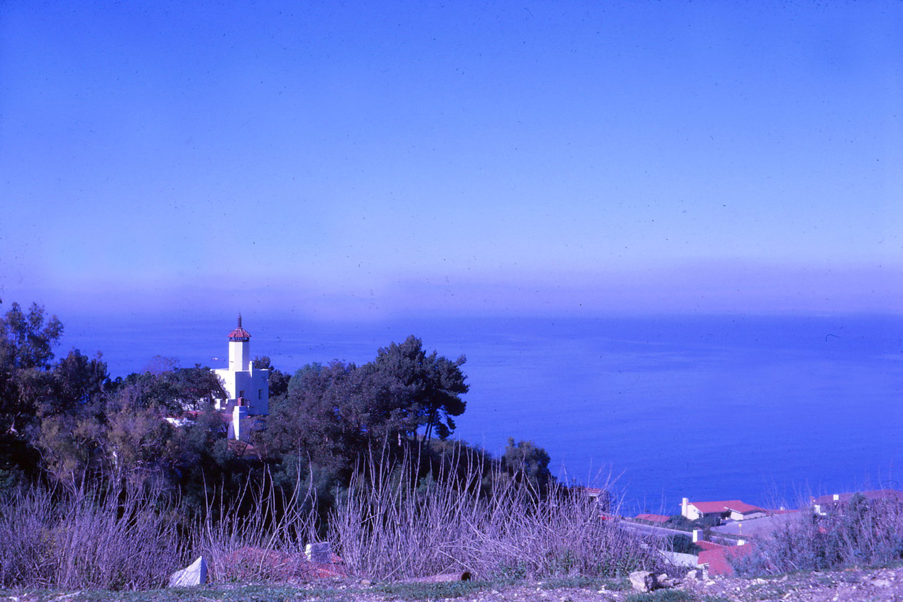
A view of La Venta Inn, looking down over Elsie's house, circa 1960.

Palos Verdes 13

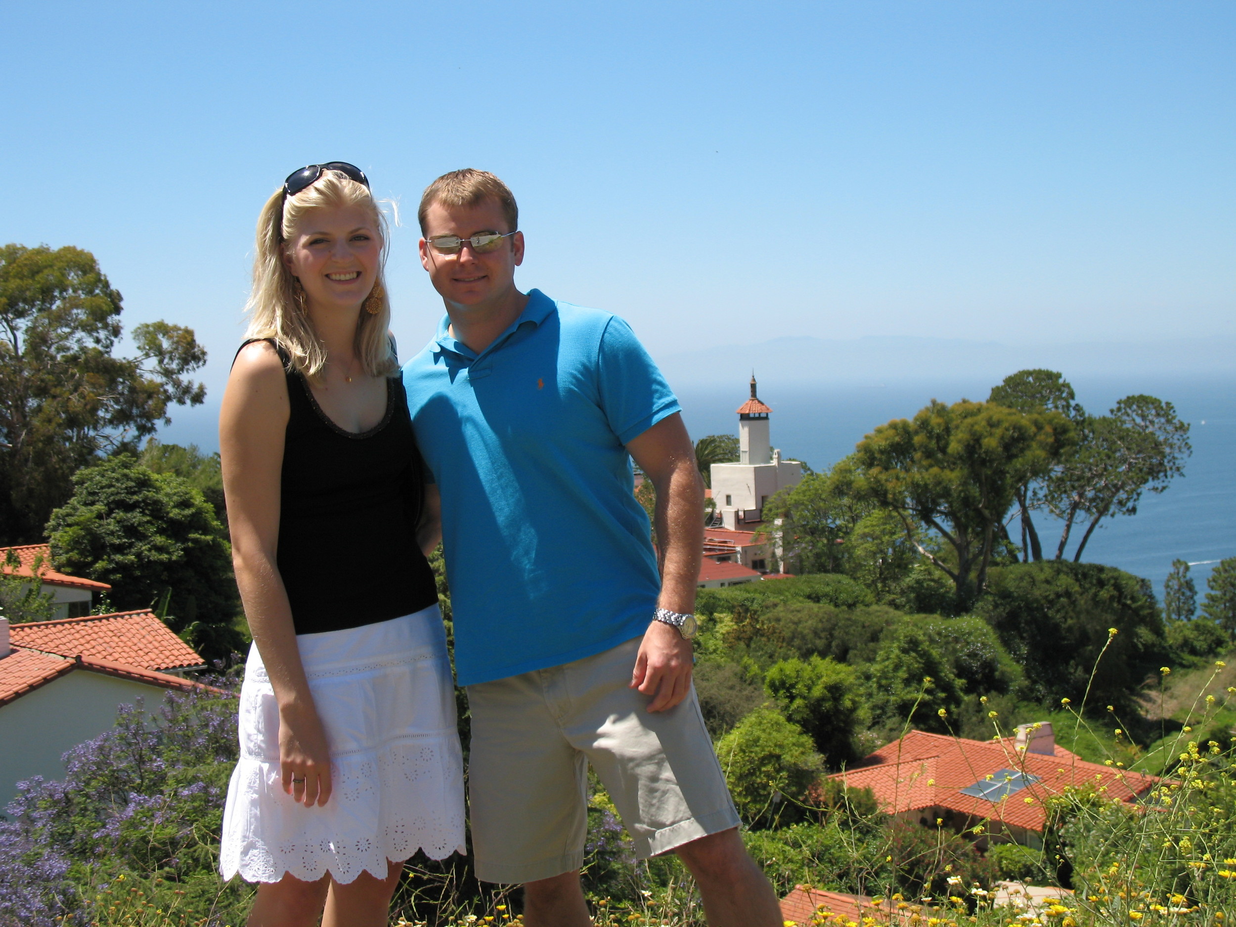
Me and Jonathan in that same spot on our first trip to PV together in 2005. Elsie's house is to our right with the skylight.

All of the above images from 1960 are from our family's film archives and were scanned and converted to digital images by Gerald and Joan. If you are interested in having us scan and preserve your family's film slides or images, contact us here. The recent images of California were taken by my mother.