home decor

beginnings of a white house

When it comes to painting the interior of a house, I tend to be attracted to polar opposites -- bright colors and creamy whites. When Jonathan and I bought our first home, the very first thing we did -- even before the furniture was moved -- was paint the rooms yellow, orange, turquoise and mocha. The colors felt beachy and were exactly what I wanted after two years in a bland apartment. After a few years of staring at those loud walls, I started to feel boxed in by my color choices. Jonathan hates to paint, but I convinced him that a switch to an all-white house would be a good idea. I started by painting our red adirondack chairs the white we selected (Dover White by Sherwin Williams), and a few weeks later, we started on the house. The hallway, living room, dining room, sunroom and bathroom were all Dover White by the time we finished. The space felt much bigger, and having a single color throughout made touch ups so easy. When we listed our house for sale less than a year later, the white walls were a huge selling feature because they were ready for any color and they looked fresh and classic. They made our 1,100 square foot cottage seem big, which isn't easy to do!

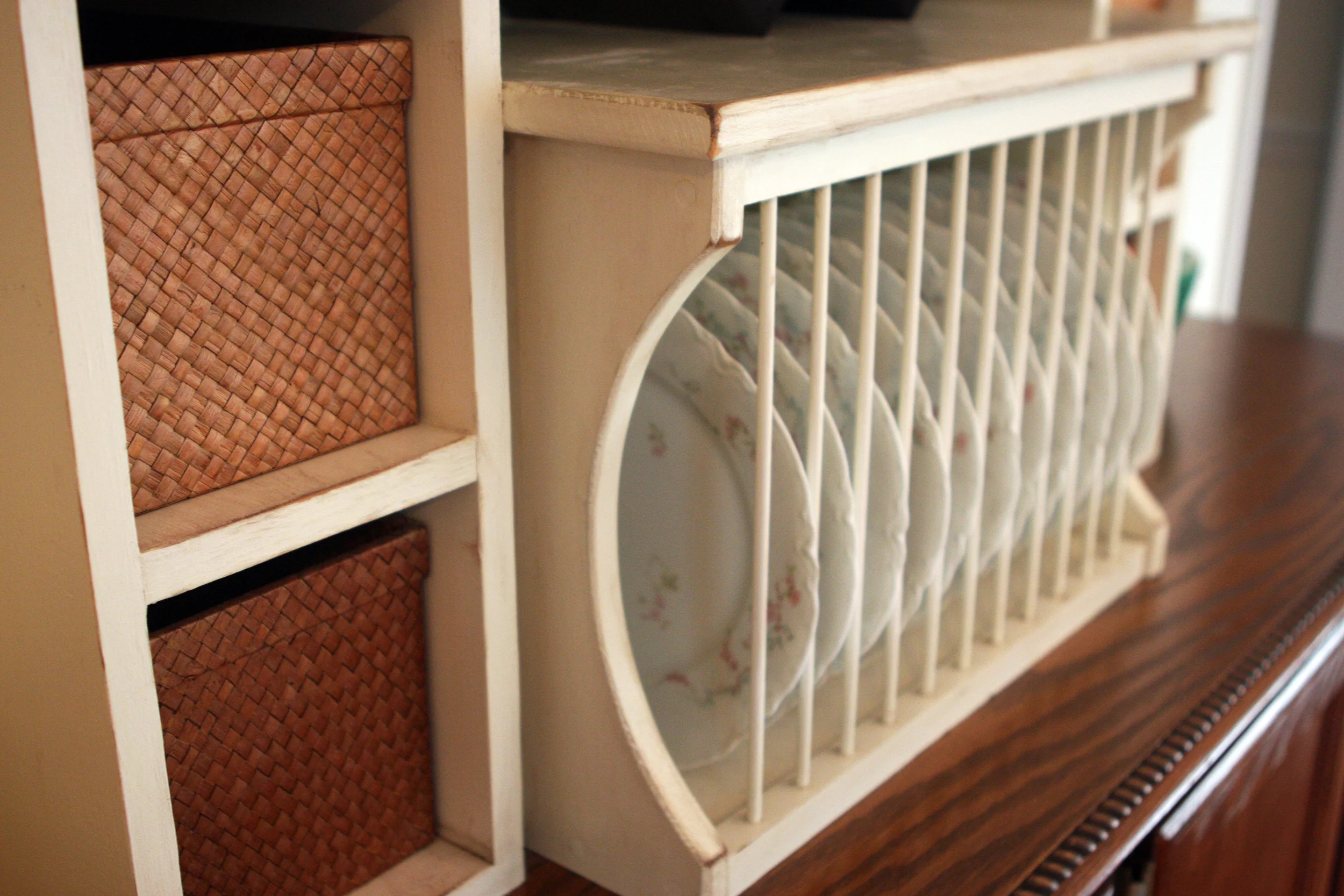
After all that paint work, it has taken me almost a year to convince Jonathan that we needed to paint our new house Dover White. Our new house, which was built in 1984, lacks the charming details of our 1950 cottage, but I knew white would still be a great choice. It makes any house seem timeless and more open, and it brightens dark spaces. Of our 3,000 square foot house, we knew the kitchen -- formerly painted a periwinkle blue and finished with a shiny, "Venetian" plaster -- would be the worst room to paint. We weren't fans of the color or the finish, and we spend quite a big of time in our kitchen, so we decided that's where we would begin. It was a monster project that involved lots and lots of sanding, even more cleaning, one coat of primer and two coats of Dover White. Because we are a bit crazy, we also painted our hallway at the same time. It was actually already painted a very boring flat white, and it looks so much better now that it's Dover White. Once I finish painting the frames on the gallery wall, I'll post some new photos of it. Here are some photos of the kitchen:

island
kitchen
credenza
IMG_4747.JPG
bowl
coffeebar
plate rack
breakfastroom
daisy.jpg

There are some things about this kitchen that we probably wouldn't have chosen ourselves, but overall it is a really efficient space that works well for us. 

Collections: Vintage lamps

img_3409.jpg

Confession: I watch Mad Men for the clothes and furnishings. In the middle of a very intense scene, I stop focusing on the characters and start zeroing in on the lamps.

Does anyone else do that?

It's true -- lamps from the 1960s and 1970s were glorious creations with tons of character. Fortunately for those of us who love them, vintage lamps aren't any more expensive than their modern counterparts, and many times, they can be purchased from flea markets, estate sales and thrift shops for much less. Antique malls and vintage shops tend to mark up their prices when it comes to vintage lamps, and a pair is definitely more expensive than a single lamp.

I scored this yellow lamp from Hoot and Louise in Memphis. I loved the modern yellow color, and the original shade was in perfect condition. Jonathan inspected the wiring, and as the price was less than what I'd pay for a department store lamp, I brought it home. The amber glass and brass lamp is one of a pair that belonged to my grandma Joan. I believe they were purchased from Ethan Allen in the late '60s or early '70s. During their first life, they were at home in her rec room, surrounded by wood-paneled walls, dark green carpet, awesome '70s artwork and the coolest (and most uncomfortable) vintage floral couch you have ever seen. I loved that room and those lamps from the time I was old enough to appreciate the space (around age 5 or 6). When we sold her home, my mom passed the lamps along to me, and they now live in my living room. I love the brass and amber glass, and the shades that are trimmed in gold velvet and cord. Our living room's white walls allow them to be the stars of the show. The artwork on the wall behind them is also vintage and was snagged from Joan's rec room. She had good taste, and good taste never goes out of style.

[gallery type="rectangular" ids="1778,1779,1781,1782,1789,1784,1786,1787,1788,1790"]

Collections: Vintage Maps

map4.jpg

Vintage maps make great wall art. Here are a few reasons why: 1. They look cool on their own (bigger maps work better here) or grouped together (we have plans for a gallery wall of our smaller maps). 2. They don't cost much (ours were purchased for less than $5 each). 3. They feel personal and one-of-a-kind (you can source your favorite locations, but you probably won't see two of the exact same map very often). 4. Their muted color palettes work well with most wall colors. 5. They are reclaimed, repurposed and oh-so-eco-friendly!

[gallery type="rectangular" ids="1501,1500,1492,1495,1499,1496,1498,1491,1497,1494,1493,1490"]

The map of Rome was purchased at P.O.S.H. in Chicago, the Capri and Los Angeles maps came from Stars Antique Market in Hermosa Beach, California and we found the Mississippi map at The Antique Warehouse in Memphis, Tennessee.

Want us to source a map for you? Contact us here.

The Color of Summer

turquoise6.jpg

Certain colors just make us think of summer. Turquoise is one of the those colors that is so fresh and pairs well with every neutral -- black, white, khaki, gold and silver. It is a great accent color for your home and works equally well for your wardrobe. Today we have pulled together our favorite turquoise home accessories that have a touch of gold. Each of these pieces is from our personal collection. Here's the story behind each piece. If you would like helping sourcing your own turquoise goodies, you can connect with us here!

Floral tray - Vintage. Scored from an estate sale several years ago for a song.

Books - Vintage. Picked up from various estate sales and antique malls.

Florentine trinket box - Vintage. Belonged to Joan and was handed down to me by my mom while I was in college.

Candles - Vintage. Previously belonged to my paternal grandmother, Lucy, who is 90 and lives in Italy. Turquoise is her favorite color.

Avon milk glass vase - Vintage. Also belonged to Joan and was given to me by my mom when I first moved to Memphis in 2006.

Heart-shaped bottle - Purchased at Disneyland when I was 12 or 13. Over the years, I have filled it with tiny shells from all of my beach trips, which basically means it has 16 years worth of shells in it!

Florentine frame - Vintage. Found at a antique mall four years ago. I put one of my beloved postcards in it. Underneath the postcard is a precious poem for a baby boy, but since I don't have a baby boy, I covered it up...for now.

Earrings - Old Banana Republic.

Bracelet and bird charm - Gifts from my sister from Anthropologie.

Leaf necklace - Gifted to me by my mom from a shop in Manhattan Beach, California that is now closed.

Polished mineral - Purchased in 1996 from a nature store in Costa Mesa, California that is now closed.

We hope you enjoyed a peek at some of our favorite turquoises pieces. Living with this color is like taking a mini-vacation.

Well, almost! :)

[gallery type="rectangular" ids="1361,1368,1362,1363,1364,1365,1366,1371,1372,1367,1373"]