Branding

BroTies branding

BroTies business cards.

BroTies business cards.

brotiesbusinesscards

So proud of these!

Gerald & Joan logo for BroTies. Image taken by Aubrey Hord for BroTies.

Gerald & Joan logo for BroTies. Image taken by Aubrey Hord for BroTies.

Gerald & Joan logo and kraft paper bands for BroTies. Image taken by Aubrey Hord for BroTies.

Gerald & Joan logo and kraft paper bands for BroTies. Image taken by Aubrey Hord for BroTies.

Gerald & Joan logo for BroTies. Image taken by Aubrey Hord for BroTies.

Gerald & Joan logo for BroTies. Image taken by Aubrey Hord for BroTies.

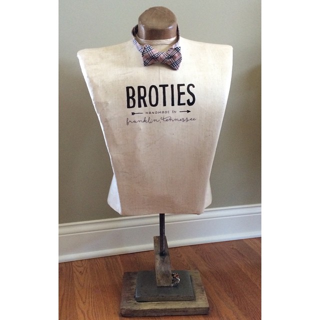
For the past few months, I've been working with the very talented Aubrey Hord of BroTies to create a handcrafted vintage look and feel for the BroTies brand. You can see my original post about the logos here.

The end results make me so incredibly proud.

The rustic logo incorporates vintage-inspired handwritten fonts and arrows. Black and white business cards seemed boring and unoriginal, so a custom vintage chalkboard design served as the background for her business cards. To continue with the vintage vibe, kraft paper bands were used to create her custom packaging. As you can see, Aubrey has also placed the logo on her kraft show booth and vintage mannequin to continue the rustic-vintage vibe.

It was so fun to work with this super talented Tennessee-based business. Please be sure to check out her handcrafted bow ties. They are so lovely!

I also need to give one last shout-out to Jessica Hord for first connecting me with her talented sister-in-law. In October 2012, this job put me on the fast-track to self-employment and living my Gerald & Joan Preservation and Design dream. Aubrey's vintage mannequin featuring my design (shown above) brings the entire experience full-circle. I can't even begin to describe how happy this project has made me. It's my vintage-inspired design dream realized. I will always be grateful to Jessica and Aubrey. You guys are the best!

new nonprofit logos for the common table

For the last three months, I've been lucky to work as a contractor for Common Table Health Alliance, a Memphis nonprofit whose mission is to achieve health equity through trust, collaboration and education. Their focus is broken down into four REAL Community Goals -- Reducing Childhood and Family Obesity, Eliminating Health Disparities, Activating Consumers, Patients and Caregivers and Lifting Health Care Quality. Pretty good stuff.

Fortunately for me, I started working with them right before they began a name change and brand overhaul, so I was able to offer up my graphic design and branding expertise, designing new logos, collateral materials, advertisements and web graphics. The three logo projects I completed for them were pretty cool, so I wanted to share them!

The first logo was for a hypertension initiative that features former Memphis Grizzlies Coach Lionel Hollins as the spokesperson. Jonathan and I were season ticket holders during Hollins' two best years with the Grizz, so this was a huge honor for me. The team knew what they wanted, so they gave me direction and I created the design:

140/90 Living Life Under Pressure logo

For the agency logo, I was charged with creating several logo options that fit the new mission and vision. I mocked up versions that represented everyone's ideas, and the top three choices were presented to the organization's community partners for a true common table vote. The design that was selected was a collaboration between me and an awesome coworker. It was a really fun project, and everyone was really pleased with the results: 

CTHAlogo.jpg

The Common Table plans three events each year, and the next one is a 5K that is organized in partnership with Memphis Mayor AC Wharton. The 5K is in its second year, and the staff wasn't crazy about the event's logo. They asked me to freshen it up, so I took some inspiration from the old logo (the tape measure) and added a sun icon (from one of my logo mockups). I tied those pieces together with the new CTHA font and the official CTHA colors to create a logo they can use for years to come:  

ACWhartonMillionCalorieBurnLOGO

I hope to share some of the collateral materials I've created for the hypertension campaign and 5K next week. I'm so proud of these projects, and I'm really grateful to the staff at the Common Table for giving me the opportunity to create fresh designs for them. It has been a fun and rewarding experience, one that has really boosted my nonprofit design portfolio and my confidence! :)