wedding invitations

Betty Wedding Invitation Suite

bettyinvitationsuite
babybetty

This week's wedding suite creation is named Betty in honor of Joan's older sister. Despite their age difference (Betty was born in 1921 and Joan in 1933), the sisters were very close throughout their lives. The above photo is Betty as a baby. Wasn't she precious?

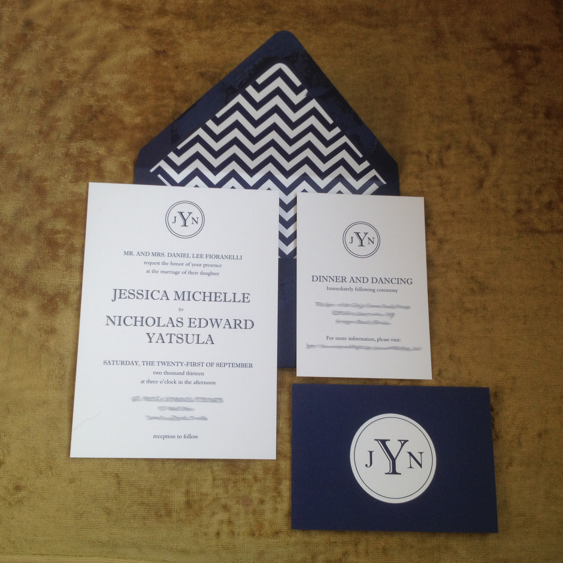
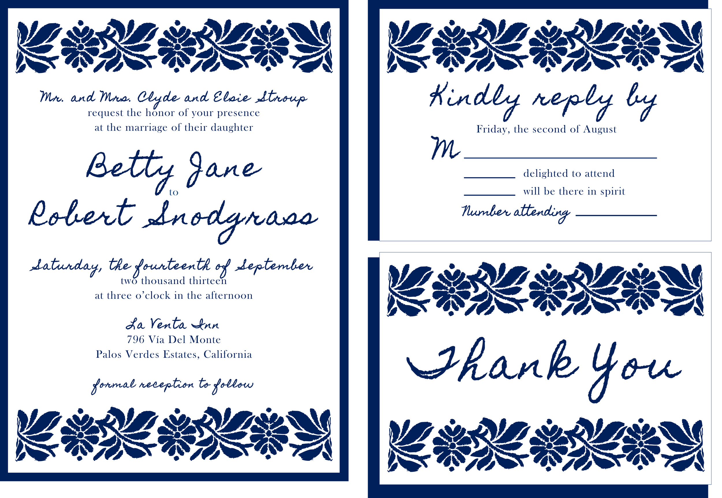
For her wedding suite, we were inspired by linoleum block printing. We wanted something that looked hand-carved and really jumped off the page. The navy and white color scheme accomplishes that nicely. For added impact, we continued the design on the back side of each piece, and then finished out the suite with our preferred mix of classic and handwritten fonts. The timeless mix of color and pattern is perfect for a spring or summer wedding. It reminds us a little of an Anthropologie dress. Can't go wrong with that!

To learn more about the Betty wedding suite, you can contact us here. We would love to customize this suite for your special day!

laura wedding suite

laurasuite.jpg

The Laura wedding invitation suite is named after my great-great-grandmother and namesake, Laura Stump Dumm. For this suite, I tried to visualize what a 1899 wedding celebration in Ohio would be like. I pictured my great-great-grandmother wearing her mother's handmade wedding dress and carrying a bouquet of daisies. The wedding would take place outside under blooming trees, and family, friends and neighbors would bring food (lots of farm fresh veggies and homemade pies!) for the picnic reception. The day would end with fireworks or a parade.

I'm not sure of my great-great-grandparents' actual wedding date, but I do know they were married in 1899. My great-great-grandfather was born on the 4th of July, so I decided to make that their wedding date. Red and greige seem a fitting color combination for July 4th park wedding, and the embroidered daisies fit with the summer picnic vibe. Thanks to the rich colors and classic fonts, this wedding suite could also work really well for a rustic or vintage-inspired fall or winter wedding.

For more information about the Laura wedding invitation suite, please contact us here

Jessica and Nick's Wedding Suite

When I first met with bride-to-be Jessica back at the beginning of the year, I asked her what design motifs she liked best. Her list included preppy, navy and white, chevrons, stripes and a monogram. Above all, she wanted something that felt timeless but would work for a summer beach wedding. The wedding suite that resulted combined all of those requests. The bright white and navy were a perfect combination of timeless and preppy, and the monogram fit the look she wanted perfectly. In order to keep the invitation itself more traditional, she opted to include the chevron pattern on a custom envelope liner. The back of the RSVP card features a large version of the same monogram, which, along with the chevron liner, is the first thing a guest sees when they open the envelope. By matching the envelope color, liner color and invitation color, we were able to create a seamless look. The finishing touch was professional calligraphy that was completed locally.

Personally, I love the way the liners turned out and am excited to try different color and pattern variations for future projects. What motif would you put on a liner?

Need help with wedding or event invitations? Click here to contact us about your next paper project!

Navy and White Monogram and Chevron Wedding Suite

Navy and White Monogram and Chevron Wedding Suite

Navy and White Monogram and Chevron Wedding Suite

Navy and White Monogram and Chevron Wedding Suite