 After six years in the world of communications and public relations, I knew our company's logo was just as important as the name of the company itself. Picking the name was easy, but the logo took a little more time.
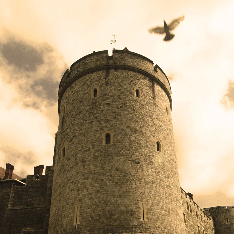
I wanted something that would appeal to men and women and could be used for further branding opportunities. I also wanted a motif that represented our diverse heritage -- California, Mississippi, Tennessee and England. When I started thinking about how to include England, I remembered a photo I had taken during our last trip there in August 2009. It was only my second trip back to the UK since my family moved to the States in 1992, and it was our first trip as a couple. As we walked around Windsor, the city of my birth, I snapped this photo of Windsor Castle. When I got home and looked at the image, I realized I had caught a pigeon in the shot. I thought the bird looked like an angel flying across the sky. It was my favorite image from that trip.
When I started editing the bird image, it became clear that it would be perfect for the logo. Birds are a huge part of Southern and West Coast culture, and this bird was actually from the English town where I was born! Jonathan and I were together when I took the photo, and it was a very special day for us.
I chose a neutral color palette of sepia tones and a handwritten name (I am drawn to things that look handmade), and then I brought in the bird to unite the logo. We are so excited with the results!